Insights from Robert Smith on the Small Business Big Insights Podcast
When Robert Smith, branding guru and “Branding King,” sat down with me on the Small Business Big Insights podcast, he distilled decades of experience working on brands like Farm Boy, the Royal Canadian Mint, and the Ottawa Senators into three core principles that any business, big or small, can apply today to make a iconic brand: Consistency, Quality, and Frequency. In this post, we’ll unpack what each pillar means, why it matters, and how you can start weaving them into your own brand strategy.
Why These Three Pillars?
Smith’s framework is deceptively simple. He argues that iconic brands aren’t born out of a single amazing logo or one viral campaign; they emerge when you master the trifecta of:
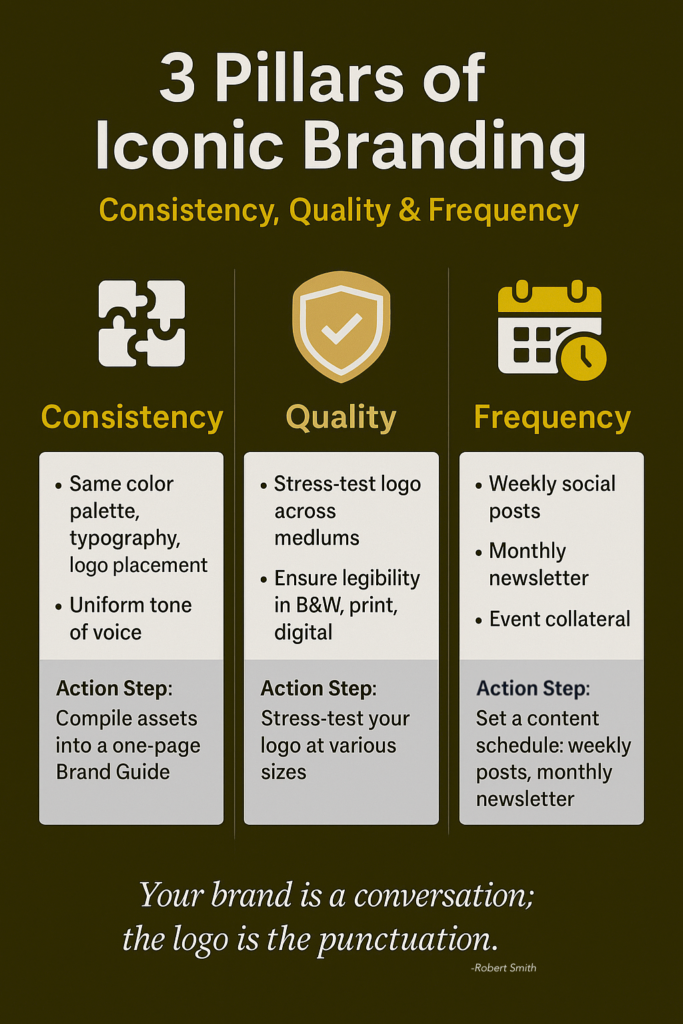
- Consistency: Making sure every touchpoint, whether online or offline, feels unmistakably “you.”
- Quality: Building a brand identity that “stresses tests” across mediums and never looks or feels cheap.
- Frequency: Getting your message in front of your audience again and again so it sticks.
“When you’ve got your consistency locked in… then we can build our social media, build our website. That’s why… the logo and brand part has to be first.”
Let’s dive deeper.

1. Pillar One: Consistency
Imagine meeting a business owner at a networking event. You’re impressed by their pitch and decide to look them up online, only to find their website, social media, and email signature all look completely different. It’s confusing, right? That’s inconsistency at work.
Consistency means:
- Using the same color palette, typography, and logo placement across all materials.
- Adopting a uniform tone of voice in web copy, social posts, and printed collateral.
- Having a clear set of rules, a Brand Guide, that anyone on your team can follow.
“If you’ve got an existing brand… take all the pieces, your logo, your social posts, website elements, and put them in one place. That lets you see what your brand is telling consumers.”
Action Step
Gather every brand asset you have(Slides, business cards, ads). Compile them into a simple one‑page Brand Guide. Look for mismatches and fix them.
2. Pillar Two: Quality
Once your brand identity is consistent, you need to make sure it’s high quality. It’s not enough for your logo to look good on a screen, will it still be legible on a golf shirt, in black and white, or blown up on a billboard?
Smith calls this the “stress test.” You apply your brand to various scenarios. apparel, signage, social avatars. And see if it holds up. If it doesn’t, you go back to the drawing board until it does.
“A lot of times people… put a drop shadow in Canva. But we do a stress test: Does it work on a golf shirt? A website? Social media? If not, we tweak it.”
Think of it this way: if your brand is a plane, consistency is the blueprint and quality is the structural integrity. Without quality, your brand risks looking amateurish, or worse, breaking entirely, when you need it most.
Action Step
Print your logo in black and white, enlarge it to poster size, and shrink it to favicon dimensions. If any version looks off, iterate until it shines at every size.
3. Pillar Three: Frequency
Even the best brands can’t rely on a single “big splash.” You need frequency! The steady drip of marketing, social media, signage, email campaigns, and in‑person touchpoints that keeps your brand top‑of‑mind.
Robert Smith points out that you meet someone at a conference, they like your pitch, and their very next step is a website or social check. If they see your brand everywhere, your email footer, Instagram posts, posters at events, that repetition builds trust and recall.
Key Frequency Channels
- Social Media: Regular, on‑brand posts.
- Email: Consistent newsletters with signature branding.
- In‑Person: Branded collateral at events, trade‑show booths, and networking mixers.
“You’re not gonna have an iconic brand if people aren’t seeing it all the time.”
Action Step
Set a realistic schedule: e.g., one social post per week, a monthly newsletter, and quarterly print collateral. Consistency and quality in hand, frequency becomes the engine that drives brand recognition.
Putting It All Together
Below is a quick look at how these pillars balance in an iconic brand. Notice that each pillar is equally essential, skimp on one, and the whole structure weakens.
Real‑World Examples
- Coca‑Cola: Same red‑and‑white script since 1886 (Consistency + Quality). Ads and packaging in every market, every day (Frequency).
- Apple: Sleek, minimalist logo and UI (Quality + Consistency). Weekly product announcements, stores worldwide (Frequency).
- Farm Boy: Distinctive black‑and‑tan logo rooted in farmer imagery (Consistency + Quality). Flyers, in‑store signage, digital ads, always Farm Boy (Frequency).
- Ottawa Senators: A consistent helmeted‑Roman Senator motif refined over decades (Consistency + Quality). Jerseys, arena signage, social engagement (Frequency).
Next Steps for Your Brand
- Audit your existing assets.
- Stress‑test your logo and color palette.
- Build a simple content calendar for weekly social posts and monthly newsletters.
Every brand, no matter how small, can start today. Grab a blank document, jot down your brand colors, font choices, and tone of voice. Then ask yourself: are these the same in every place my customer sees me?
“Your brand is a conversation. The logo is the punctuation at the end of that conversation.”
Let consistency, quality, and frequency guide your next moves. With these pillars in place, you’ll be that unforgettable brand people can’t help but recognize, trust, and choose.
What will you tackle first? Let me know in the comments below!
